
Waterman's Brewing Co.
Waterman's Brewing Co.
Waterman's Brewing Co.
Playful and vibrant illustrated can labels for a local craft brewery.
Packaging

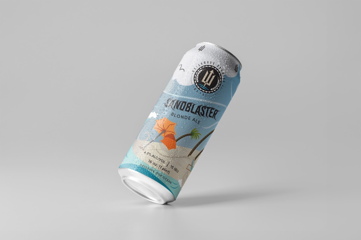
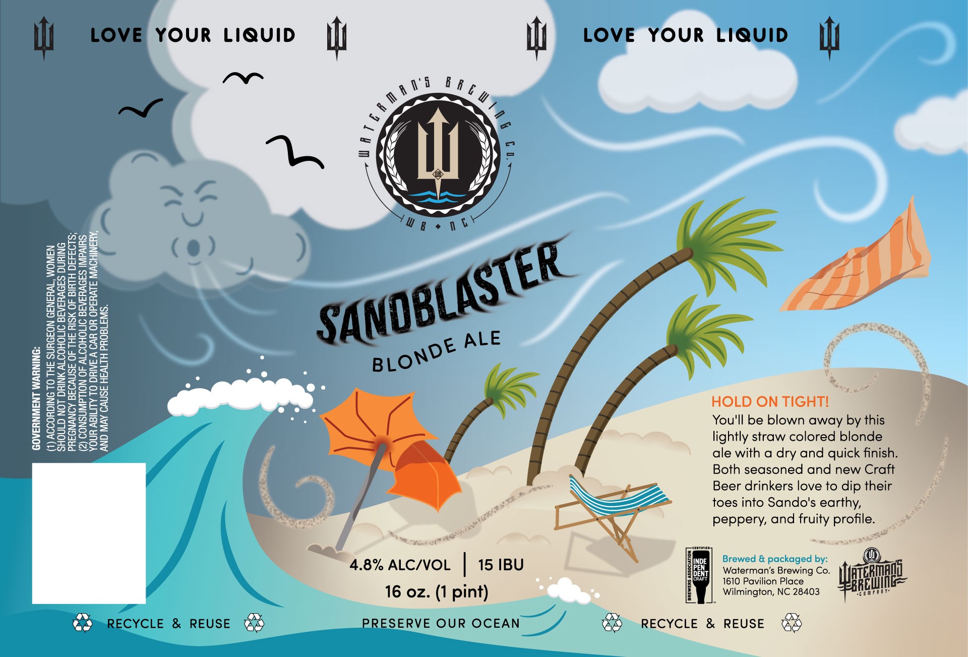
Waterman’s Brewing Company (WBC) is a family-friendly craft brewery and restaurant near Wrightsville Beach, NC with a passion for the local coastal community.
When I came on board, WBC was looking to expand their canned offerings. Their cans are distributed hyper locally (within a 5 mile radius) and serve primarily as a means to draw customers to the brewery. The owners wanted colorful, playful label designs that celebrate the beach and reflect the fun, laid-back vibe their brewery is known for, while the brewmaster preferred a more modern, minimal aesthetic. So the challenge was combining those styles, creating clean designs with whimsical elements while still maintaining brand recognition, which was achieved through consistent illustration style, layout, and typography across all labels.
Client:
Client:
Client:
Waterman's Brewing Company
Skills:
Skills:
Skills:
Illustration, Hand Lettering, Package Design, Print, Digital
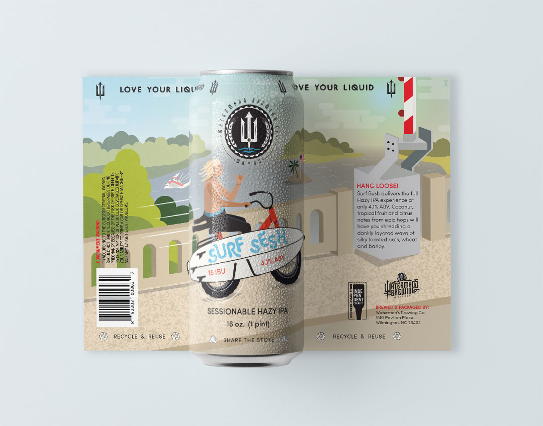
Surf Sesh Hazy IPA
Surf Sesh is a tribute beer to the local community and a surfer friend of the owners who had passed away. After exploring several directions, we settled on depicting a surfer crossing the Wrightsville Beach bridge on a hazy morning. I created custom illustration and hand lettering to bring personality to the label. Small details, like palm tree island in the background, might go unnoticed by a wider audience but are unmistakable to the local crowd and bring to life the client's tagline: Love Your Liquid.
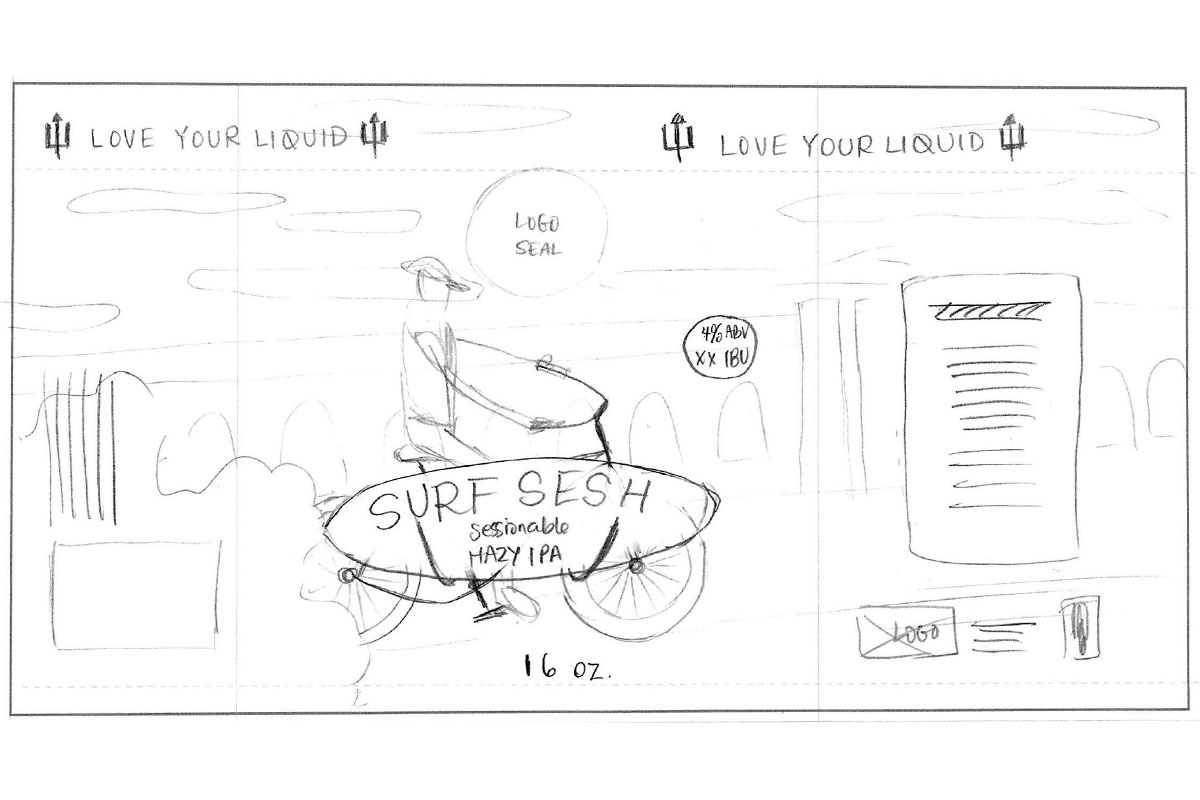
Label Progression
Concept Sketch
Refined Sketch
First Draft Label
Final Label


Label Progression
Concept Sketch
Refined Sketch
First Draft Label
Final Label
Label Progression
Concept Sketch
Refined Sketch
First Draft Label
Final Label
Label Progression
Concept Sketch
Refined Sketch
First Draft Label
Final Label
Oktoberfest Festbier
WBC crafted a new beer for their annual Oktoberfest event and asked me to create a can label, along with coordinating poster design and digital ads. They wanted the label to scream Oktoberfest, so I relied on classic imagery of blue and white checks and lederhosen but gave it a modern twist by simplifying and playing with scale. Custom illustrations and thoughtful touches, like using the brand mark on the buttons, brought the client's vision to life across the marketing collateral.


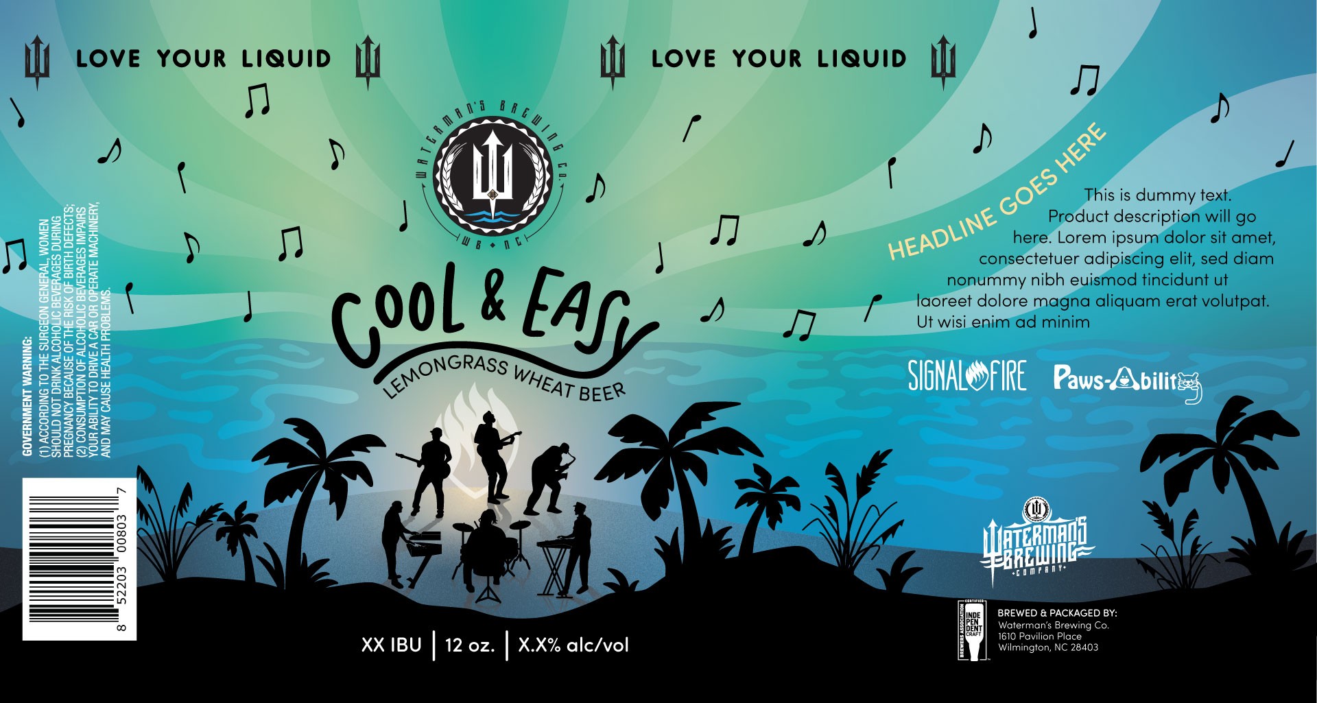
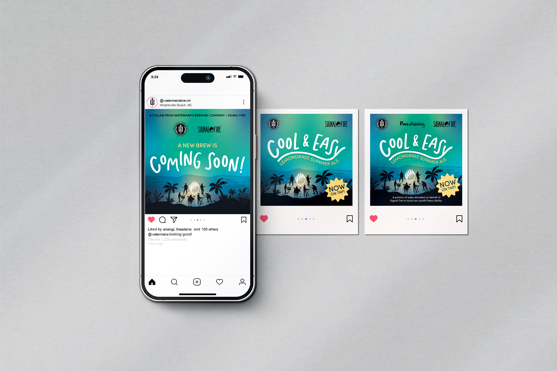
Cool & Easy
In collaboration with local reggae band Signal Fire, WBC created a new beer and tasked me with designing its label. This label needed to capture the relaxed vibe of the brew's namesake song, Cool & Easy, and include the band members and their logo, plus a charity logo. Custom hand lettering and illustration, combined with a cool, beachy color palette inspired by the band's website, resulted in a label that all stakeholders were happy with. I extended the design to a coordinating poster, as well as Instagram posts and story templates for a launch event.
Label Progression
Click through to follow the label from concept to finished design.


Additional Labels
I created several other label designs for WBC that didn't end up being put into production, including for a new line of hard seltzers. In order to differentiate this new product line and fit better with the package style of competitors, we switched up the label layout and created a more minimal, clean design. However, by using the same flat illustration style, typography and similar logo placement, I was able to achieve the client's goal of having a fun, yet cohesive, set of can labels.


© 2025 Elana Núñez-Tiso
© 2025 Elana Núñez-Tiso
© 2025 Elana Núñez-Tiso
© 2025 Elana Núñez-Tiso