
Spectrum Sensoreum
Spectrum Sensoreum
Designing a playful and accessible brand identity for a museum.
Identity Design

Spectrum Sensoreum is an immersive, sensory museum and play space for people on the autism spectrum.
Filling a huge gap in the market with their innovative approach, this conceptual client has an amazing mission: providing a safe, inclusive play space where Autistic people can be themselves. They have designed their spaces and activities to be welcoming and accommodating to Autistics of all ages and they needed a visual identity system to match. The brand needed to feel fun and playful without being childish, while also being accessible with easy to understand messaging.
Client:
Client:
Client:
Client:
Spectrum Sensoreum
Skills:
Skills:
Skills:
Skills:
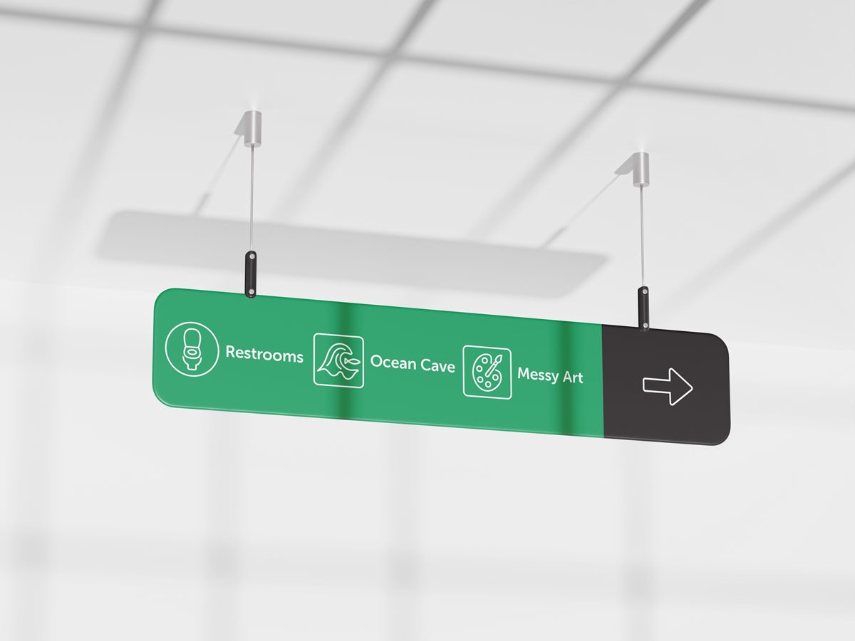
Logo & Branding, Icons, Pattern, Copywriting, Animation, Print, Digital, Merch, Signage

visual identity
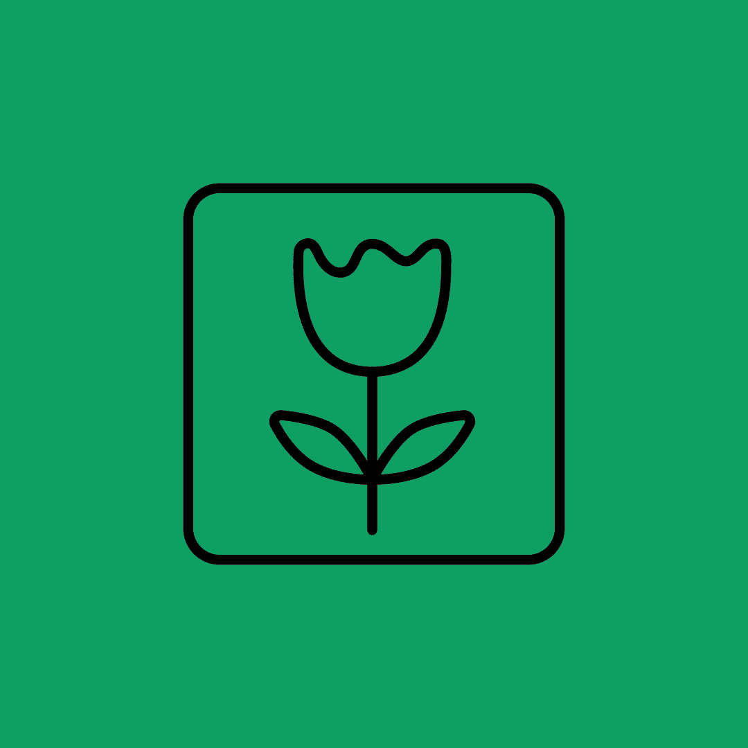
Since many Autistic people are highly visual, I started with imagery. The logomark represents an 'S' and pulls together symbols of neurodiversity and play in a pleasing, repetitive way. I then created a set of icons to represent all areas of the museum and combined them with lots of whitespace and simple typography for clarity across touchpoints. Whimsical elements, like hand-drawn squiggles and a muted rainbow color palette, help convey the movement and excitement that guests will find at this one-of-a-kind institution.
visual identity
Since many Autistic people are highly visual, I started with imagery. The logomark represents an 'S' and pulls together symbols of neurodiversity and play in a pleasing, repetitive way. I then created a set of icons to represent all areas of the museum and combined them with lots of whitespace and simple typography for clarity across touchpoints. Whimsical elements, like hand-drawn squiggles and a muted rainbow color palette, help convey the movement and excitement that guests will find at this one-of-a-kind institution.


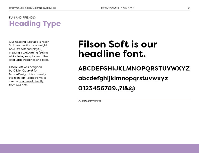


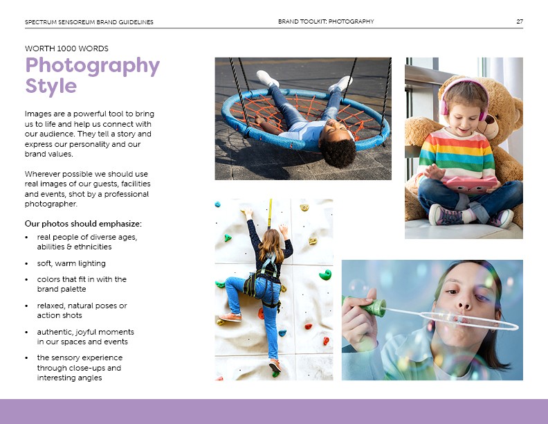
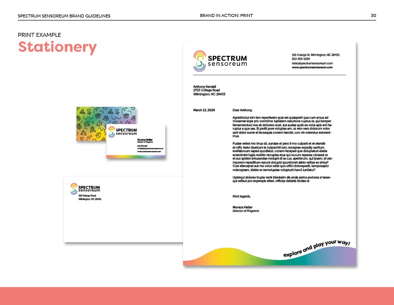
Swipe to see a selection of pages from the Brand Guidelines.
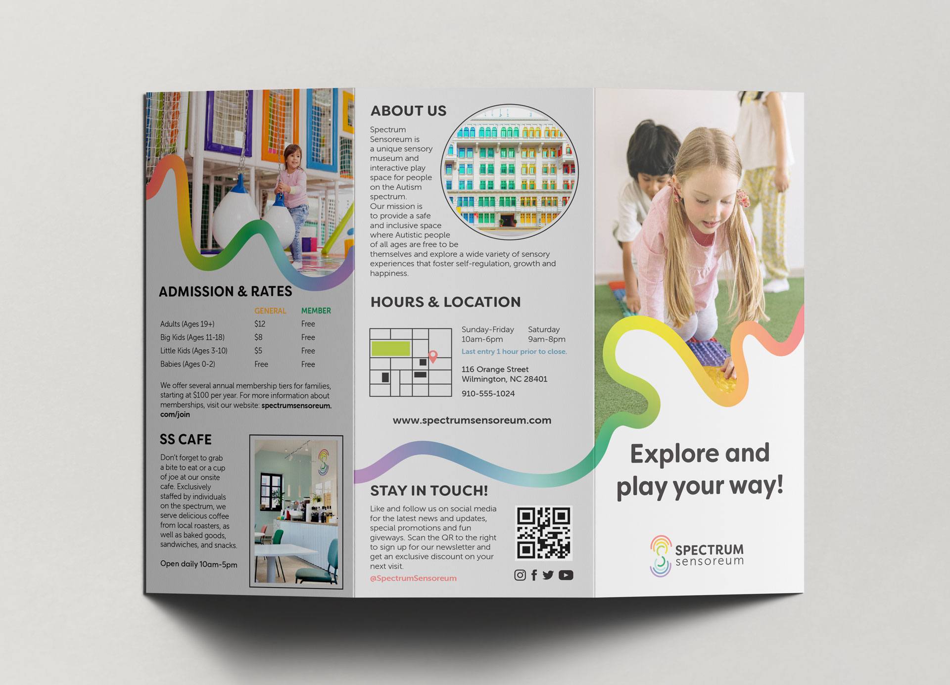
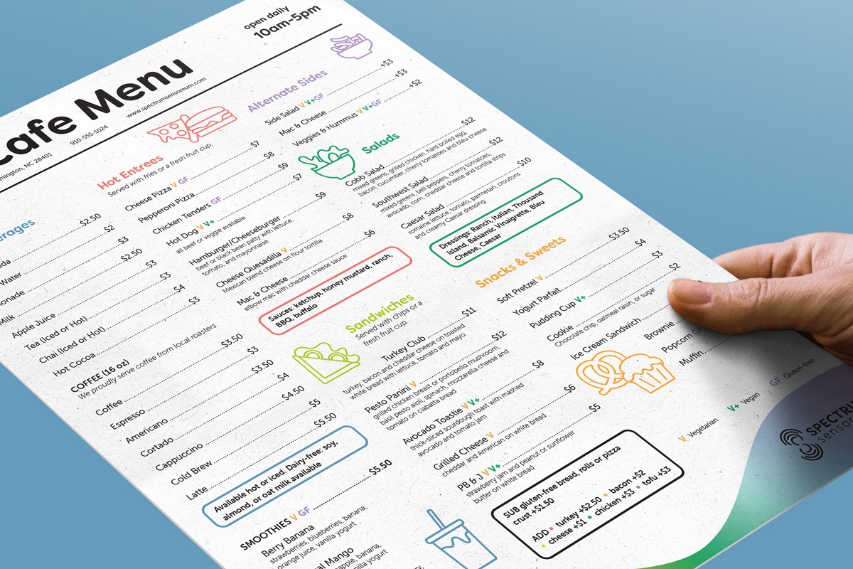
Brand Applications
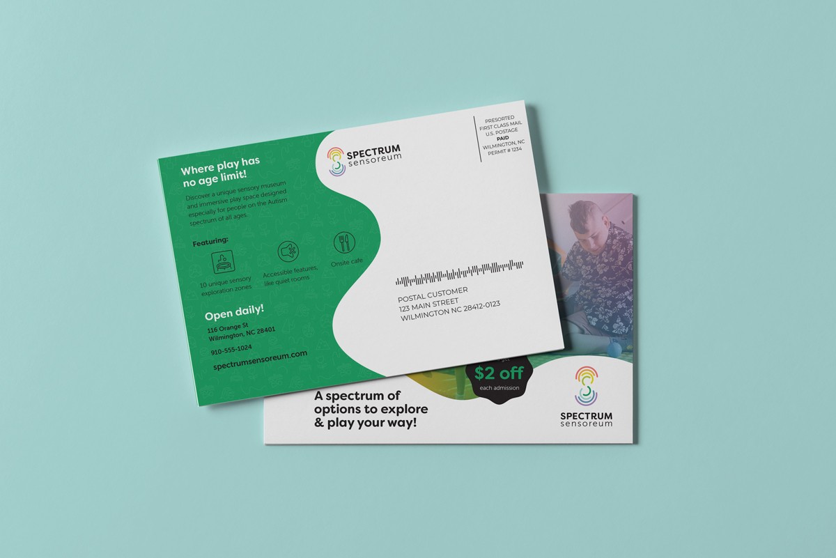
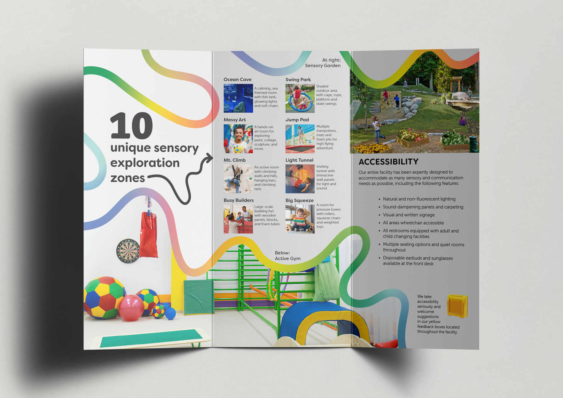
Once the visual language was established, I set to work creating a cohesive suite of collateral. Since consistency, legibility and visual cues are important for making information accessible to the target audience, I focused on creating clean, easy to read layouts with accompanying images. The elements of the new identity system work together to bring their brand to life across a variety of touchpoints, from printed materials to social media to signage.
Brand Applications
Once the visual language was established, I set to work creating a cohesive suite of collateral. Since consistency, legibility and visual cues are important for making information accessible to the target audience, I focused on creating clean, easy to read layouts with accompanying images. The elements of the new identity system work together to bring their brand to life across a variety of touchpoints, from printed materials to social media to signage.


© 2025 Elana Núñez-Tiso
© 2025 Elana Núñez-Tiso
© 2025 Elana Núñez-Tiso
© 2025 Elana Núñez-Tiso